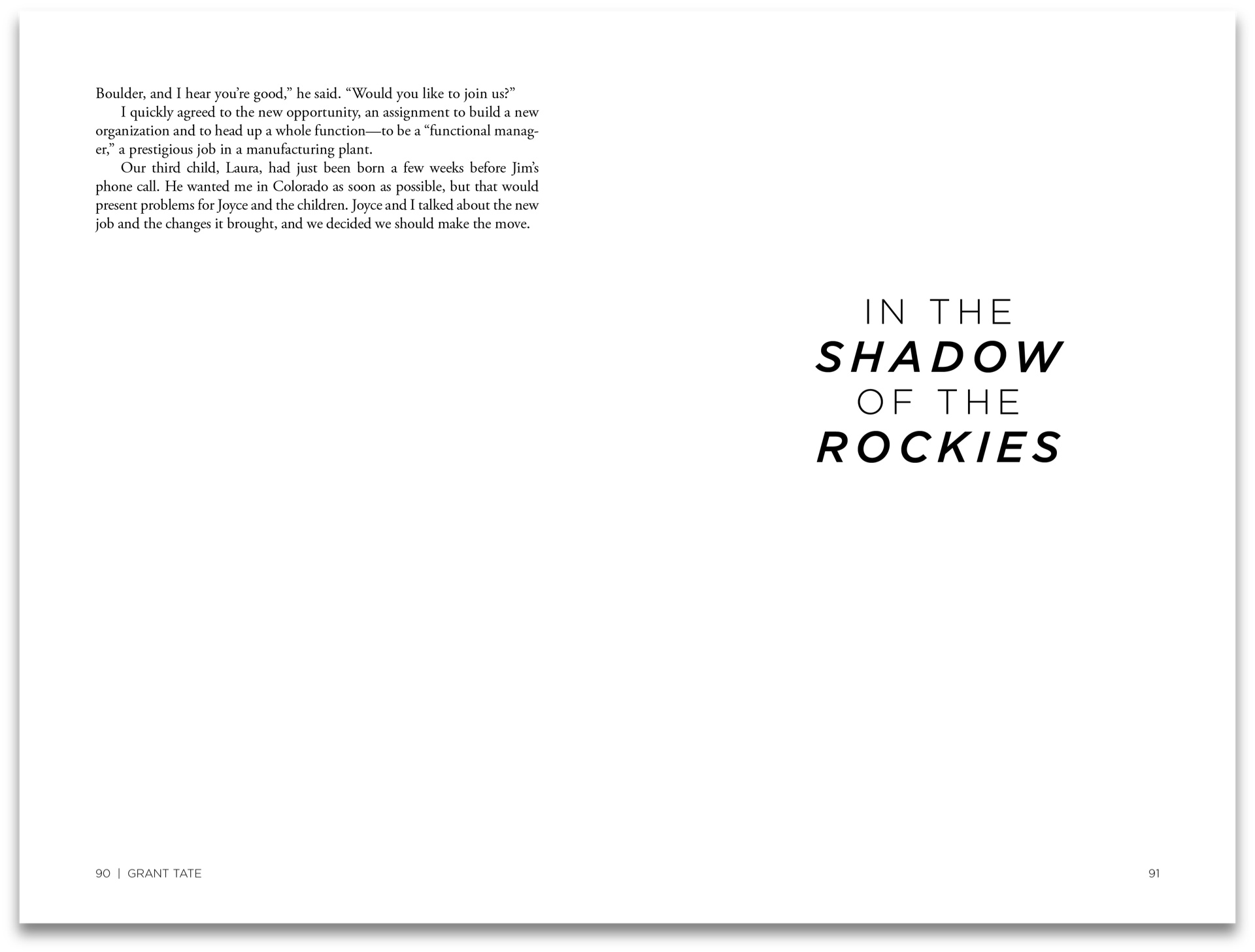
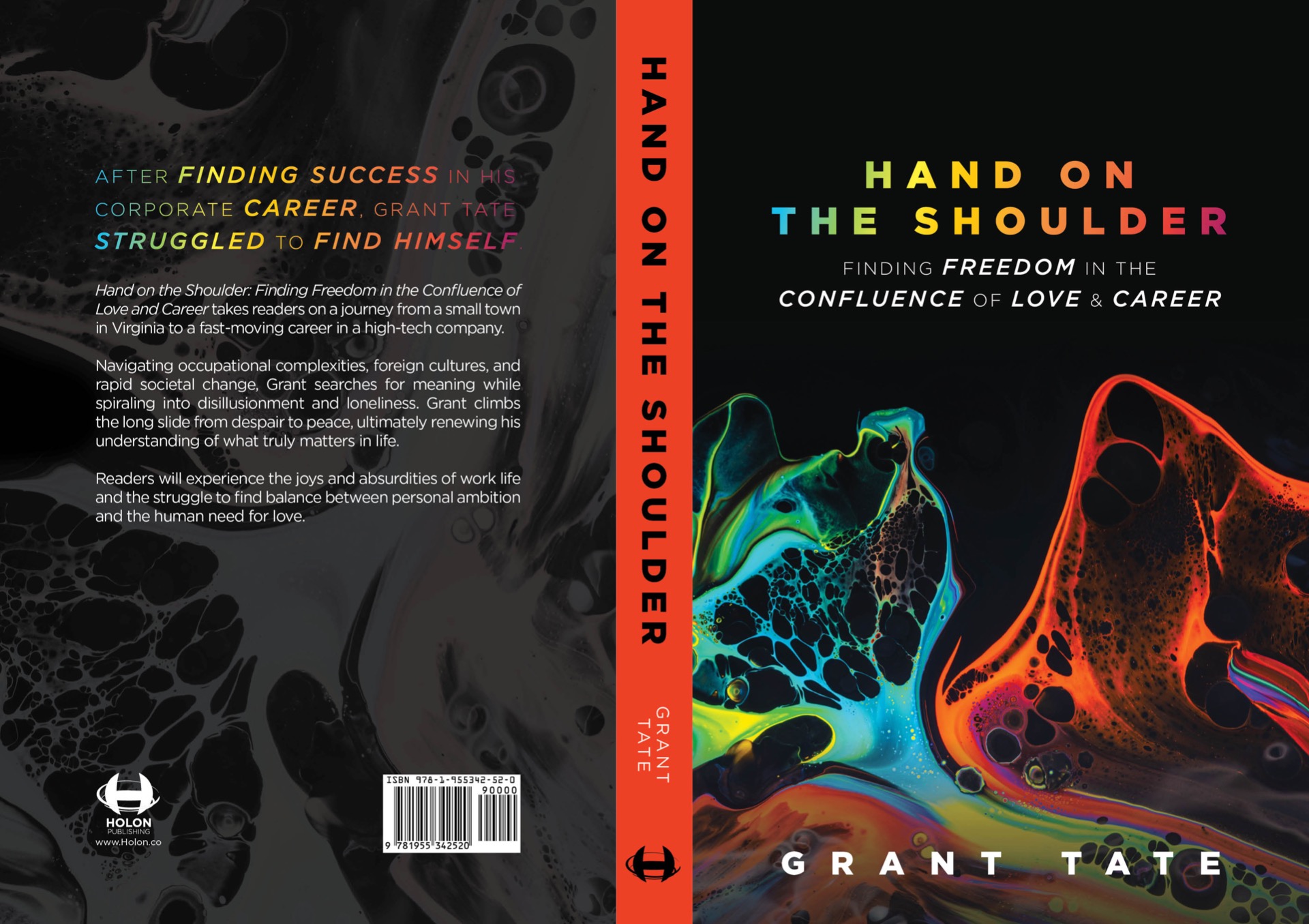
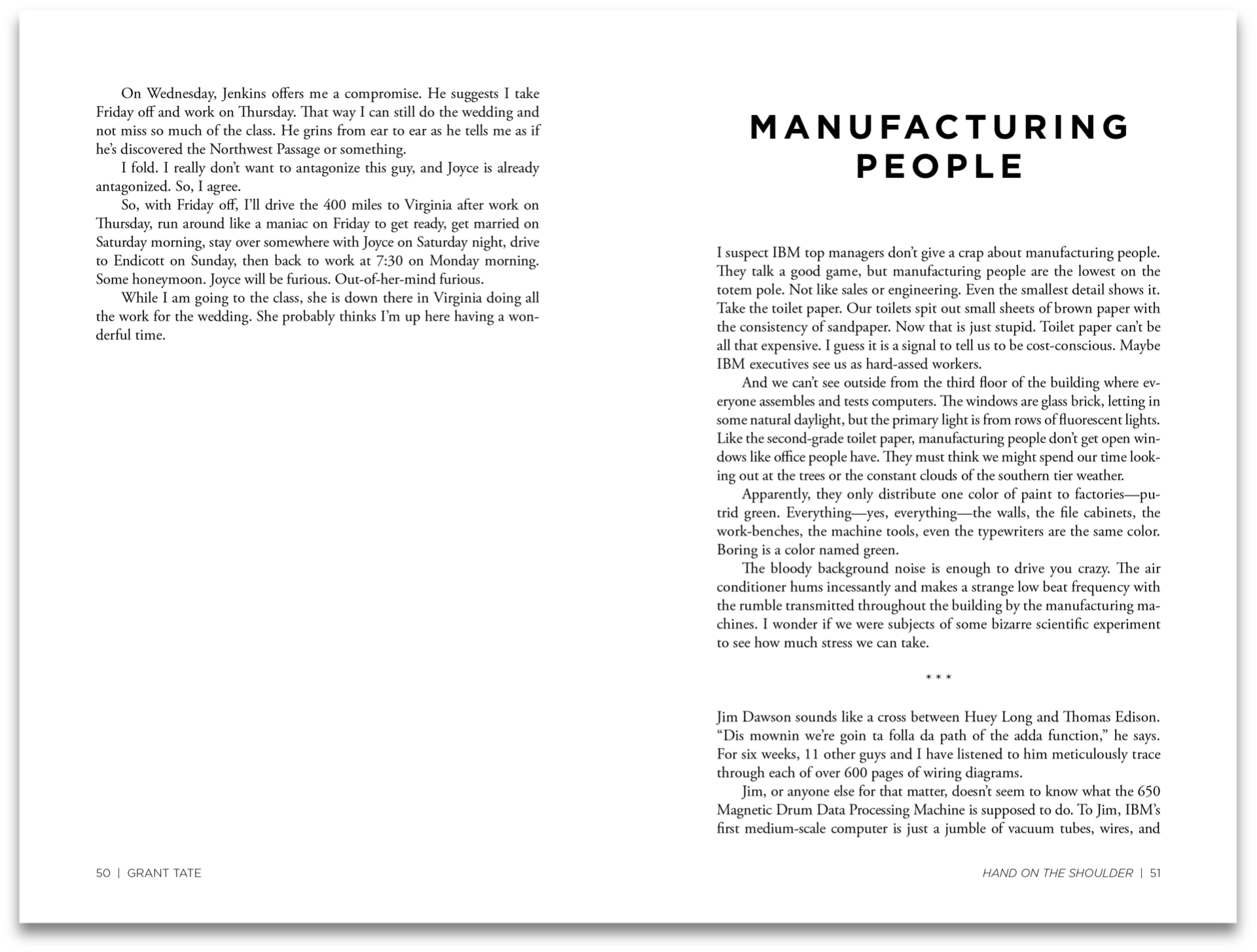
In my experience, many of my clients have come to me with a vision of what they think their book should look like; the vision propels the project forward, which is always beautiful to see, but there is usually a give and take, and it is rare that a client lets me completely take the reins and execute my full vision. Grant Tate was one such rarity. He had an eye for modern art, and so I was able to provide him with a variety of cover options that I felt would be right for him. He chose this design for its bold, conflicting colors and abstract representation of a confluence, which was at the heart of his story. For the interior, I let the mix of modern and traditional fonts set the tone and translate the author's own journey of conflicting self discovery and focused on good, clean typesetting.
I would recreate this book a thousand times over. It will always be one of my favorite projects.
For more information on this title, you can view the Amazon listing or visit handontheshoulder.com.


